Hi, I'm Gini's portfolio!
Portfolio · Digital Products
Product Design
6 case studies
Rember
No data entry CRM · Generative UI feature for customers and sales leads database into Kanban.
Heritage Patterns
B2B material database, verified supplier marketplace, and AI commerce agents for an industry that still sources fabric by trade show · Open Layer 1 foundation earning permission to layer payments and agentic reordering on top.
CrowdMap
Reimagining the dating app experience with matching teams/businesses/orgs for symbiotic partnerships · Facilitating strategic business relationships to help fellow entrepreneurs.
Fire Investigation Training Simulation
Educational Game · VR headset project turned desktop simulation game for fire investigator training courses at JIBC.
Tugboat Simulator at the Vancouver Maritime Museum
Children's cooperative experience design · Reimagining a 1990s static wheelhouse exhibit as a multi-player interactive tugboat simulator for Vancouver Maritime Museum's new Children's Area.
Ethica: Browser Extension for Online Grocery Shopping
Product strategy + UX + Market Research · End-to-end research and design for a browser extension helping consumers shop ethically.
Portfolio · Services
Service Design
4 case studies
Grantable
Grant writing services for Canadian musicians and artists · End-to-end system design for both client + admin portals to help musicians and artists apply for funding opportunities that are the best fit for their creative careers and stay on top of deadlines and required to-do's.
BC Services Card Accounts
Digital identity 2FA for 5.5+ million residents of British Columbia· Eliminating the digital divide for the vulnerable population of BC.
BC Tokens
2FA Codes for the BC Services Card Accounts login system for people who cannot or do not want to use a smartphone · Mail delivery of the BC Token hardware device to remote areas of BC.
BC Human Rights Tribunal + Access to Justice
Legal research database for self-represented litigants · Co-designing a guided search experience for prescedents with best legal research practices from lawyers and stakeholders as subject matter experts.
Portfolio · Print Products
Print Design
3 projects
Color + Journal
Mental health colouring book with journaling pages · A print-on-demand project blending colouring therapy and reflective writing for mindfulness practice.
Soundscape Prints
Sound-inspired abstract print series · Limited-run art prints paired with music that facilitates emotional expression and connections.
Mermaid Cat
Collaboration with audio engineer on a children's book series · Character design, book layout design, and incorporating (but not relying on)generative AI for brainstorming creative directions.
Portfolio · Creative
📷 Camera
Mixed Media · Photography · Video
Portfolio · Psychology
Experience Research
Usability · Heuristics · Design Principles
BC Human Rights Tribunal
Contextual inquiry and thinkaloud protocols on CanLii experience informing data-driven design of a legal research database for self-represented litigants. Included subject matter expert interviews, usability testing, keep-fix-change analysis, and a near-death experience(?).
Grantable
Discovery-phase stealth research for a grant writing service, acting as a project manager for realistic client interactions and qualitative data collection. Synthesised client interactions and feedback survey data to define core pain points across the grant-writing service journey.
BC Services Card Accounts v.s. BC Services Card
A 2x2 factorial methods research plan to highlight confusions and misinterpretations created from the service product name. Mixed-methods research design isolating branding as the measurable cause of user confusion.
BC Services Card Accounts: ID Verification with Video
Pinpointing the root cause of countless operations resources being drained from multiple government service providers to address citizen inquiries needing repetitive attempts to set up the BC Services Card Accounts mobile app. Stakeholder interviews, workflow observation, and competitive analysis established the foundation for end-to-end UX design.
Get in Touch
Contact Gini
Book a call
Schedule a 30-minute intro call to discuss your project, team, or role. Pick a time that works for you.
Book a callBC Human Rights Tribunal · Law Foundation of BC · Sept 2020 – June 2021
Redesigning Access to Justice: Legal Research for Self-Represented Litigants
Improving a legal research database so that people navigating the BC Human Rights Tribunal without a lawyer could actually find what they needed — without drowning in results.
The Problem
People without legal representation — known as self-represented litigants — must navigate a dense legal research database to find case precedents, policies, and procedural documents.
The existing search experience was designed with trained lawyers in mind: too many irrelevant results, opaque terminology, and no scaffolding for users unfamiliar with legal language.
The core challenge: how do you design a research tool that empowers someone with no legal training to find the right information, confidently?
My Role & Approach
I led the UX research and design workstream, collaborating directly with lawyers, policy staff, and tribunal stakeholders. My responsibilities spanned discovery to delivery.
- Contextual inquiry with lawyers and self-represented litigants to map the gap between expert and novice mental models of legal search
- Heuristic evaluation of the existing database against accessibility and usability standards
- Card sorting and tree testing to redesign the IA around how non-experts think about legal topics, not how legal taxonomy is organised
- Iterative prototype testing in Figma — low-fi to hi-fi — validating IA and interaction patterns with real users
- Stakeholder alignment sessions with lawyers and Tribunal staff to reconcile user needs with legal compliance requirements
Key Insights
- Self-represented users relied on everyday language, not legal terminology — the existing keyword search created a vocabulary mismatch that returned 50–80 irrelevant results per query
- Users felt overwhelmed and lost confidence when faced with a wall of results; they needed progressive disclosure and clearer hierarchy
- Filtering options were present but invisible — users didn't know they existed until prompted
- Task completion rates in baseline testing were low; users consistently abandoned searches or chose incorrect documents
Design Decisions
- Restructured search filters to surface the most commonly needed categories up-front, reducing irrelevant results by removing default broad matches
- Introduced plain-language labels and tooltips for legal concepts, built in collaboration with legal staff for accuracy
- Redesigned results hierarchy to distinguish case types, making the most relevant documents visually prominent
- Added a "guided search" entry point for unfamiliar users alongside the power-search for experienced users
Outcomes & Impact
- Reduced initial search results by 65% — users reached relevant documents faster with fewer false starts
- Task completion rate improved significantly across usability testing rounds
- Project recognised as a Finalist for the SFU Computer Science Diversity Award (2022)
- Delivered a handoff-ready Figma prototype and annotated design system to the development team
Reflection
This project taught me that designing for equity means designing for the most vulnerable user, not the average one. The biggest challenge wasn't the UI — it was bridging two completely different worldviews: the formal taxonomy of law and the intuitive language of someone who just needs help.
Sitting in that gap, between legal experts and everyday people, is where the most important design decisions live.
Process Artifacts
Grantable · 2022 · Service + Product Design
Grantable
Grant discovery and application platform for nonprofits — designing a service that simplifies finding and applying for funding.
The Challenge
Nonprofit grant seekers struggled to track opportunities, understand eligibility requirements, and manage application deadlines across a fragmented workflow. Existing tools were built for funders, not applicants.
Outcome
Case study in progress — contact Gini directly to discuss this project in detail.
Government of BC · 2021 · Service Design
BC Services Card Accounts
Digital identity and account management for BC residents — designing the service layer for provincial digital identity.
Overview
Case study in progress — contact Gini directly to discuss this project in detail.
Government of BC · 2021 · Design Systems
BC Tokens
Design system token layer for the BC provincial design system — establishing a scalable, accessible token architecture for government digital services.
Overview
Case study in progress — contact Gini directly to discuss this project in detail.
EquipFlow · 2023 · Product Design
EquipFlow
End-to-end UX design for a B2B SaaS platform managing equipment inventory, tracking, and rental workflows for field-based industries.
Overview
Case study in progress — contact Gini directly to discuss this project in detail.
Heritage Patterns · B2B Marketplace · 2026 · Founder & Product Design
Heritage Patterns
Designing the open material database — and the marketplace, payment rails, and AI commerce agents that will sit on top of it — for an industry that still sources fabric by trade show.
01 / Context
A mid-size brand still discovers fabric suppliers at one of four annual trade shows — Première Vision, Texworld, Intertextile, Milano Unica. International payment between a Korean mill and a US label still moves over SWIFT, costing 3–6% in FX fees with 2–5 days of settlement risk. Physical swatches still travel via DHL for every sample request, each cycle taking two to six weeks.
Heritage Patterns is a B2B platform designed to compress the entire workflow — discovery, sampling, payment, reordering — into a single verified, transactional layer.
The thesis: if you build the right open foundation — a free, exhaustive material sciences database — you earn the permission to layer a marketplace, global payment rails, and AI commerce agents on top of it. This case study covers the design of Layer 1, and the architectural decisions that make Layers 2 and 3 inevitable rather than speculative.
Six problems with how the industry currently works
- Discovery is offline. No always-on digital equivalent to a trade show exists. Sourcing decisions wait on quarterly calendars.
- Payment is slow and expensive. SWIFT wires between hemispheres fail at higher rates in emerging markets — exactly where many of the best mills operate.
- Sampling is physical. Every approve/reject cycle is a fortnight. No standardized 3D digital samples exist.
- MOQs crush emerging brands. Indie designers either over-order and tie up working capital, or get locked out of premium materials entirely.
- Compliance lives in PDFs. GOTS, OEKO-TEX, Bluesign certifications travel as email attachments. No verified, on-platform certification layer.
- Recurring orders are manual. Re-ordering the same base fabric for a new season requires revised POs and renegotiation — even when nothing has changed.
02 / The Brief: A Three-Layer Platform
Heritage Patterns is structured as three layers, each one earning the right to the next. The discipline is to design all three together — schemas, hooks, taxonomies — while shipping them strictly in sequence. Nothing gets rebuilt later. Things get switched on.
03 / Research: Two Archetypes, One Shared Problem
Phase 1 onboarding is focused on two archetypes whose pain points form a closed loop: the small independent mill desperate for digital reach, and the indie designer brand desperate for direct supplier access. Solving for one creates demand for the other.
Both archetypes share a single underlying problem: the supply chain treats them as inputs to other people's systems. No one has built tools that respect their actual workflow — the mill's craft, the designer's vision. Brokers extract value precisely because the principals can't find each other.
The pivotal moment is sampling. A digitally-credible 3D fabric sample reduces a 4-week sample cycle to a 30-second decision. This insight reframed Layer 1 from a directory into something more ambitious: a browsable material library where every entry is paired with a verified supplier you can transact with.
04 / Principles: Five That Every Decision References
- P/01 — Material first, transaction later. L1 is an open educational resource, not a funnel. The database serves anyone in fashion — designers, students, researchers — without registration. Trust precedes commerce. Brands and suppliers convert into Layer 2 because they want to, not because we walled them in.
- P/02 — Verified everywhere. Every supplier KYC'd via Stripe Identity. Every certification — GOTS, OEKO-TEX, Bluesign — live-verified against the issuing body's API. No PDFs in inboxes. The competitive moat is not the catalog. It's the verification layer underneath it.
- P/03 — Phased architecture, never refactored. L1 hooks and schemas are designed against L2 and L3 contracts. The Supabase swap point in
useMaterials()is single-purpose and single-place. The matching algorithm is scoped to v2 — but the schema fields it will need are already in the table. - P/04 — Dark editorial, not bright SaaS. This is a tool for designers, mill owners, and creative directors — not a B2B procurement portal. The aesthetic respects the audience's eye. Generous whitespace, characterful typography, restrained color. The interface should feel closer to a publication than a dashboard.
- P/05 — Stablecoins where they solve real problems. USDC isn't applied broadly. It's a Phase 2 solution for supplier payouts to Bangladesh, Peru, Vietnam — markets where SWIFT is the actual bottleneck. Anywhere domestic ACH or SEPA works well, those rails win. The discipline is restraint: justify the rail, don't lead with it.
05 / Taxonomy: A Four-Category Visual System
Every material in the database belongs to one of four categories. Each category is paired with a dedicated color and procedural pattern that appears on cards, in filter chips, in supplier badges, and in the detail drawer. The pattern signals category before the text label does — allowing fast visual scanning across a feed of dozens of materials.
The patterns also solve a cold-start problem. Until each material has a verified 3D scan from its supplier, a procedural texture renders in its place. A database with fifty grey placeholders looks empty. A database with fifty distinct procedural textures looks alive.
06 / Interface: Five Decisions Worth Defending
The current build is a React + GSAP single-page application built around a vertical scroll feed of material panels. The interaction model borrows from editorial publishing rather than e-commerce.
-
D/01 — Scroll-velocity skew, not card grid. Each material panel skews on the X-axis based on scroll velocity. Fast scrolling produces dramatic shear; slow scrolling settles to neutral. The effect renders the feed as moving fabric — a quiet metaphor for what you're browsing. The math matters: at the wrong damping coefficient the effect feels like motion sickness; at the right one, it feels like silk.
-
D/02 — Push drawer, not modal. When you tap a material, the feed compresses left and a detail drawer pushes in from the right at a 1:2 ratio. The feed remains visible, browsable, still scrollable. Modals create a context switch. The push drawer maintains context — you can still see the feed you came from, the materials adjacent to your selection, the rhythm of what's around.
-
D/03 — Procedural textures as fallback, not placeholder. Until each supplier provides a verified 3D sample, a procedurally generated fabric texture renders in its place — tuned per category, with subtle variation per material. A cold-start catalog with greyboxed placeholders looks dead. A catalog with distinct, characterful textures looks like a working publication.
-
D/04 — Gated supplier reveal, with signal preserved. For every material, the supplier's country and verification badge is public. Their contact details — email, phone, ordering interface — are gated behind brand verification. This protects suppliers from spam outreach (the primary reason mills don't put their info on the open web) and creates a clear economic boundary between Layer 1 (free) and Layer 2 (paid).
-
D/05 — Single Supabase swap point, one hook. Every data fetch flows through a single hook —
useMaterials(). The current implementation returns seeded data; the production implementation will hit Supabase. The swap is one file, one function. This is the architecture discipline that lets Phase 1 ship without Phase 2 rework.
07 / Process: A 12-Week Phase 1 as Three Sequential Experiments
The Phase 1 plan is structured around three experiments, each one validating the assumption underneath the next. The structure prevents the most common failure mode for B2B platforms: building elegant infrastructure before knowing what it should do.
-
Week 0 — Pre-build setup. Stripe Connect (Custom). Supabase project. Next.js skeleton on Vercel. Day-1 schema for materials, suppliers, brands, orders. No code shipped to users — accounts and rails only.
-
Weeks 1–4 — E1: Concierge supplier onboard. Manually onboard 10–15 real mills. Stripe Connect accounts created via hosted onboarding links. 30+ materials added to the database by hand. Thirty-minute Zoom interview with every onboarded supplier — every friction point becomes a future feature. Target: 10 suppliers, 30+ materials, 10 interviews logged.
-
Weeks 2–5 — E2: The 50-material landing page. A static Next.js page surfacing 50 verified materials with a "Request Access" form. The hypothesis: a credible database earns inbound brand interest before the marketplace is built. Above 15% conversion = strong pull. Below 5% = the messaging is wrong. Target: 500+ visitors, 30+ access requests, 5 buyer interviews.
-
Weeks 3–6 — E3: First real transaction (pivotal). One brand pays one supplier through Heritage Patterns. Stripe Payment Links, manually invoiced, 5% platform fee, T+7 payout. Ugly, manual, pivotal. Every friction point logged into a "Friction Log" Notion doc that becomes the infrastructure backlog. Before Week 6, Heritage Patterns is a directory. After Week 6, it's a marketplace.
-
Weeks 5–10 — Core infrastructure build. Programmatic Stripe Connect onboarding. Checkout sessions with platform fee routing. Webhook handlers. Radar custom rules. Stripe Tax. Subscription billing. Algolia search. RFQ flow. Supplier dashboard via Stripe Connect Embedded Components.
-
Weeks 10–12 — Beta launch. Invite-only access to founding brand members. Founding-supplier email. Personal customer support inbox. Product Hunt launch prepared for Tuesday slot. Target: 15+ suppliers, 50+ materials, 30+ brand members, 3+ transactions.
08 / What's Next: Phases 2 and 3
Because the schema and hooks were designed against L2 and L3 contracts in Phase 1, the subsequent phases are largely about activation rather than construction. New rails, new flows — but the foundational data model and component tree remain stable.
-
Phase 2 (Months 5–9) — Global payouts & USDC settlement. Stripe Treasury financial accounts hold platform float. USDC settlement to suppliers in Bangladesh, Peru, Vietnam — markets where SWIFT routinely fails. Milestone-based payment escrow ties releases to logistics API events (Flexport, project44). Full Stripe stack — Issuing, Tax, Sigma — comes online. Target: 500 suppliers, 200 brand accounts, $1M+ GMV.
-
Phase 3 (Months 10–18) — AI agents & autonomous reordering. Stripe Shared Payment Tokens scoped by brand. Claude-powered inventory agents read production schedules, calculate runway, and reorder from pre-approved suppliers when stock drops below threshold. Apply for Stripe ACP partner status — putting Heritage Patterns materials directly into ChatGPT Shopping and other agentic surfaces. Target: 20% AI-placed orders, $10M+ GMV, 50+ countries.
Accelerator pathways — Google for Startups, Alchemist, Forum Ventures, YC — are milestone-gated, not calendar-gated. The Week 6 first transaction unlocks one application tier. The Phase 2 GMV target unlocks the next. Traction is the application.
09 / Reflections: Three Things Worth Carrying Forward
-
A marketplace is not a marketplace until something moves through it. Building elegant UIs before having one real transaction is the most common failure mode for new B2B platforms — beautiful component libraries running on theoretical demand. Heritage Patterns inverts the priority: Week 6's ugly Stripe Payment Link matters more than Week 5's polished material card. The transaction is the artifact that converts a database into a platform.
-
Stablecoins are justified where they solve real problems. USDC adds friction in markets with strong banking rails. The discipline was restraint: use stablecoin for the Bangladeshi mill where SWIFT actually fails. Use ACH for the US supplier where ACH works. The rail is justified by the problem, never the other way around.
-
Designing for the next layer is the only way the next layer ships. The materials table has fields the current UI doesn't render. The
useMaterials()hook is a single swap point. The category map is exhaustive. None of this matters for Phase 1 — and that's exactly why it has to be done in Phase 1. Architecture decisions are cheapest to make before the system has users; they become prohibitively expensive afterward.
CrowdMap · 2022 · Product Design
CrowdMap
Real-time crowd density visualisation — UX/UI design for a monitoring tool helping event organizers manage crowd safety.
Overview
Case study in progress — contact Gini directly to discuss this project in detail.
Justice Institute of BC · 2021–2022 · UX Design + Instructional Design
Award-Winning Training Simulation: Fire Investigation for the Justice Institute of BC
Designing a cross-platform desktop simulation that lets fire investigators practice high-stakes scene analysis in a safe, repeatable, and engaging digital environment.
Award-Winning Poster
Submitted to the UBC Designing for People awards — won the Impact Award 2021.
Context & Team
Over a 13-week process, an interdisciplinary graduate team of 7 Master's students at the Centre for Digital Media were tasked with developing a computer-based learning tool for emergency training scenarios. Using agile methods, the team created an interactive virtual environment to enhance the learning experience for the Fire & Safety Division at the Justice Institute of British Columbia (JIBC), with a specific focus on post-fire inspection.
Team: Ralph, R. · Brown, E. · Choi, G. · Hackett, T. · Kadivar, A. · Mehta, A. · Whatley, C. · Qian, K. · Zhang, J. · Walker, B.
Target users: JIBC fire investigation students and JIBC instructors.
The Problem
JIBC is a university with training programs in public safety, justice, and emergency social services — where people get trained and certified to become firefighters, police officers, paramedics, and other specialised public sector professions in BC. As part of their firefighting training programs, JIBC students need to take a series of specialised courses to learn all the required steps and paperwork needed for fire investigation.
JIBC previously had to test students on fire investigation procedures with real-life scenarios by physically burning fake rooms in shipping containers to recreate smoke patterns at burn sites and simulate arson crime scenes. Burning these shipping containers solely for educational purposes was a significant problem:
- Harmful for the environment
- Expensive and time-consuming for JIBC to buy furniture and materials to burn
- Smoke patterns are sometimes not even realistic due to the different wind flows of individual shipping containers, without air vents or windows of real apartments or houses
- After the first student moves around evidence to practice fire investigation, the fake room will not be the same experience for next students
We needed to build a new alternative way to offer students experience in an immersive, hands-on environment to apply their textbook learning — without the environmental cost, the physical danger, or the single-use limitation.
The Challenge — Pivoting Away from VR
JIBC originally requested a VR training simulation to make more use of the Oculus Rift VR headsets they had already invested in. The clients came with a solution already in mind, driven largely by previous funding investment decisions — a sunk cost fallacy.
We needed to challenge the status quo and push the clients to consider a more user-centred solution that prioritised the needs of students (primary users) and instructors (secondary users). Several factors made the VR path untenable:
- Because of COVID-19 lockdowns, JIBC students were taking courses online — many living all across different provinces in Canada. A VR solution would have been unfair to students too far away to use the Oculus headsets at JIBC's campus in New Westminster
- Some students were not confident with technology and experienced headaches and motion sickness with VR headsets
- Certification still required students to be tested at a real burn site, meaning VR would not fully replace the existing method anyway
- The design challenge involved highly specialised procedural steps that only licensed firefighting professionals would know — we needed to become experts in a very short time
The clients were initially resistant to pivoting to a computer-based simulation. We needed to build the case — and the courage — to challenge their requests, since they were based largely on sunk cost reasoning. Once we convinced JIBC to use the device option that would better fit students' current and future needs for online learning, we maximised our impact: the solution became scalable to any students learning fire investigation procedures from anywhere in Canada, or any other English-speaking country.
The accumulative environmental impact of fire investigation training programs burning shipping containers globally — for both education and certification — is also significant in its contribution to air pollution and climate change. Digitising the practice step of this process addressed a problem far beyond a single institution.
The Solution
As a solution, the graduate team at the Centre for Digital Media created a virtual environment to provide more practice opportunities in post-fire scenarios — safe, repeatable, and cost-free to run.
The working prototype allows the user to watch a brief background context tutorial video in which the Incident Commander describes the initial inspection and results of a house fire in the bedroom, reflecting specific standard procedural steps. Once the user completes the tutorial video, they enter the 3D virtual environment. Walking through a house, the user can use different tools to investigate the space — including tracking soot-covered footsteps in the main bedroom.
The interdisciplinary team used 3D models and Unity (a real-time development platform) to create the interactive space. The 3D environment was designed to be deployed as a practice training tool at JIBC with the potential to be used across multiple fire training settings, including remote training.
My Role
As Lead UX Designer and Product Owner, I co-led the team of 7 from discovery through delivery — my first time co-leading an agile team and facilitating design sprints entirely online. I drove the research process, owned the design system and Figma handoffs, facilitated all sprint cycles, and managed the client relationship throughout.
- Advocated for and led the pivot from VR to computer-based simulation
- Subject matter expert interviews with JIBC instructors and licensed firefighters
- Journey mapping across 3 iterative versions to model the full fire investigation procedure
- Figma UI design for all core interactions, refined iteratively in Unity
- Agile sprint facilitation — weekly check-ins with clients across 15 iterations
- Coordinated 150+ email invites to JIBC students and the North Vancouver Fire Department for usability testing
- Affinity mapping of qualitative data to inform sprint priorities and tickets
- Weekly client presentation slides summarising testing findings and design changes
User Involvement
The end users involved 2 groups: students and instructors in the Fire & Safety Division at JIBC. Since it was a focused target user group, some of which we were already collaborating with, we were able to leverage the client relationship to regularly hear from both user groups throughout each iteration.
- Subject matter expert interviews with JIBC instructors and staff — regularly throughout the project to understand both user groups' needs in detail
- Co-designing approach with JIBC instructors for learning content and student submission formats to ensure our solution fit JIBC's education program curricula
- 150+ email invites coordinated with JIBC staff to JIBC students and the North Vancouver Fire Department (past JIBC students) for 2 major public-facing rounds of usability testing before the full public launch
Barriers We Navigated
- Unfortunate team conflicts due to cultural clashes and prejudices
- Managing client expectations — especially after proposing the pivot away from VR and challenging their sunk cost reasoning
- None of our team members had any prior experience building virtual worlds in Unity Game Engine or linking project files to GitHub
- Fully online usability testing made it harder to observe users' device setup and how they preferred to interact with hardware
Project Timeline
- Jan 18 – Jan 22 — Group formation & project briefing
- Jan 25 – Feb 12 — Ideation, low-fidelity prototyping & peer-testing cycle
- Feb 15 – Mar 5 — Technical development & test planning
- Mar 15 – Mar 22 — User testing sessions
- Mar 23 – Apr 2 — User test analysis & design revisions
- Apr 5 – Apr 16 — Final client presentation & delivery of final deliverables
The Process
In any project, I strive to make data-driven design decisions that prioritise end user and stakeholder needs. The following outlines the research and design process for this project in chronological order.
1. Discovery Research
In the first introduction week with the clients, I asked for any available statistics or information JIBC had already collected on their students and instructors. I wanted to investigate students' current needs — lots of unforeseen circumstances had arisen with COVID pandemic lockdowns that significantly impacted their now-online education experience.
Given the wide range of age groups JIBC students fall under, we suspected many would not have grown up in the digital age. The data confirmed this: the Fire & Safety Division alone had 501 students aged 15–24, 1,116 aged 25–34, 1,103 aged 35–44, and 729 aged 45–54. We also found that many JIBC students were opting to take their classes online even before the pandemic, and were scattered all across Canada — data that directly strengthened our argument for a computer-based simulation over VR headsets.
2. Subject Matter Expert Interviews
To understand the exact procedures for fire investigation, we needed to interview JIBC instructors and licensed firefighters who knew the specialised process in depth. I first combed through all course materials JIBC instructors sent us and created journey maps, then iteratively refined them according to client interviews and feedback across three versions.
3. Literature Review — Ebbinghaus Forgetting Curve
Since the purpose of this product was to educate JIBC students on the many steps involved in fire investigation, and since it involved the topic of learning and memory, I drew on the Ebbinghaus Forgetting Curve. People are prone to losing memory over time, especially when newly learned information is not reviewed repeatedly. The strength of memory retention depends on how many times a person reviews the information and how emotionally engaging the learning experience was.
Given the learning curve for students to memorise all the stages and steps of fire investigation, students would need to check their task list multiple times before it stuck. This directly informed two design decisions:
- A persistent task list on the top-left of the screen to reduce cognitive load and provide a memory refresher for next steps mid-investigation
- A step-by-step task list accessible from the main menu for students to deliberately practise recalling all necessary stages before entering the simulation
4. Prototype Testing — 15 Iterations
We built prototypes from week 1 to test concepts and refine our approach with weekly client check-ins across 15 iterations. I first designed several iterations of the UI core interactions in Figma, then refined the design iteratively after testing in production in Unity Game Engine.
5. A|B Testing — Radial Menu vs. On-Screen HUD
With different design hypotheses for core interaction patterns, we needed to test assumptions rather than guess. For the core tool interaction buttons, we tested two approaches: a hidden radial menu style versus an on-screen heads-up display (HUD) style.
The result was unanimous: 8 out of 8 students preferred the on-screen HUD style. Our concern that persistent on-screen buttons would interfere with visual exploration of the burn site was never mentioned as an issue by any participant — validating the design and removing a debated assumption.
6. Usability Testing & Synthesis
For the final iterations before public launch, I created a Miro board with a consistent testing script that all teammates could follow for online usability testing sessions with real JIBC students. Qualitative data collected was analysed using affinity mapping on the same Miro board to determine improvements needed and inform sprint ticket prioritisation.
Every week we updated the clients on user testing findings and any design or product changes made based on feedback from each iteration round.
Key insight categories that drove design iterations:
- Controls: click-hold-and-drag instead of keyboard shortcuts to rotate objects; faster walking speed
- UI Updates: move quit button further from other important buttons; camera zoom / take photo; visibility of guide & task list; vertical button arrangement on the right periphery
- Tutorial Video: background context video, task list walkthrough, and controls & buttons tutorial added before first investigation
Outcomes & Impact
- Delivered across a compressed 13-week timeline with 15 major design iterations and weekly client check-ins
- Coordinated 150+ usability test invites across JIBC students and the North Vancouver Fire Department; 2 major public rounds before launch
- 🥇 Gold — Horizon Interactive Awards, Web-Training & E-Learning Category (2022)
- 🏆 Impact Award — UBC Designing for People 2021 Student Showcase
- Product was integrated into JIBC's active Fire Origin I & II courses and continues to be used to this day — with many positive student reviews reported back to us by JIBC
- Clients loved working with us so much they personally reached out after the project term to offer continued contract work to my colleague and me
- Solution is currently being upgraded to a Unity WebGL build for browser accessibility — eliminating the download requirement and further expanding reach
Conclusions & Reflection
This project highlighted the possibilities for interdisciplinary teams working in a project-based setting — and the scalability of digitising complex, costly, and site-based simulations. By involving both primary and secondary users consistently throughout the process, we built a solution that worked even under the unforeseen online learning conditions of the COVID-19 pandemic.
The most important lesson: the clients aren't always right about the solution — but they're always right about the problem. JIBC knew their burn-site training was broken. We had to do the research to show that the fix was a computer-based simulation, not a VR headset, and then build the courage to make that case. Challenging sunk cost thinking with data, user needs, and a clear alternative is some of the most important work a UX team can do.
The most meaningful design decision was the on-screen HUD — validated unanimously in A|B testing and confirmed to not interfere with visual exploration. And the task list, grounded in the Ebbinghaus forgetting curve, turned out to be one of the most appreciated features by students navigating a genuinely complex procedural task for the first time.
To see the full team process, visit the team blog: blogs.thecdm.ca/flashovr/
Color + Journal · 2022–2026 · Print Design · Illustration
Color + Journal
A mental health colouring book with integrated journaling pages — blending colouring therapy with reflective writing prompts into a mindfulness practice in print.
01 / Concept
[Placeholder] The origin story — why pairing colouring therapy with guided journaling creates something neither does alone, and the personal motivation that sustained this project over four years.
[Placeholder] The core format: alternating illustration spreads and journaling pages, organised around emotional themes — anxiety, self-compassion, grief, gratitude, growth. Each pairing is designed so the act of colouring softens resistance to the writing prompt that follows.
02 / Themes & Structure
[Placeholder] How the book is structured — chapter arcs, the emotional journey from front to back cover, and the reasoning behind the sequence of themes.
03 / Illustrations
[Placeholder] The illustration approach — line weight, subject matter, and complexity calibrated for colouring. How the emotional tone of each piece was set through composition and negative space rather than colour.
04 / Journaling Prompts
[Placeholder] How the prompts were written — therapeutic grounding, tone, and the deliberate connection to the illustration on the facing page. Where open-ended reflection was chosen over prescriptive exercises.
05 / Design System
[Placeholder] Typography, interior grid, cover design, and the visual language that carries across the whole book — how to look calm and inviting without being clinical or prescriptive.
06 / Print Production
[Placeholder] The print-on-demand setup — platform selection, paper stock, binding, sizing, bleed/trim specs, and how production constraints shaped design decisions from the start.
07 / Reflections
[Placeholder] What this project taught about sustained personal creative practice, self-publishing, illustration-as-product, and writing as a design material — and what comes next.
Soundscape Prints · 2023 · Illustration + Print
Soundscape Prints
Limited-run art print series translating sonic frequencies, waveforms, and auditory experiences into abstract visual compositions.
Concept
Each print in the Soundscape series is derived from actual audio waveform data — visualised, abstracted, and composed into high-contrast limited-run prints.
Process
Mermaid Cat · 2022 · Character Design + Print
Mermaid Cat
Whimsical character design and limited-run art print collection — the Mermaid Cat universe brought to life in a series of collectible illustrations.
Concept
The Mermaid Cat is a character exploration project — a whimsical universe of a cat who is also a mermaid, rendered in various styles across a collectible print series.
Prints
Government of BC · 2021 · Mixed-Methods Research
BC Human Rights Tribunal — Research Study
Mixed-methods UX research informing a full redesign of the BCHRT legal research database — reducing barriers to justice for self-represented litigants navigating a complex government system.
Research Questions
How do self-represented litigants and tribunal staff currently navigate the legal research database? Where does the system fail them — and what mental models are they actually using?
Methods
- Contextual interviews with 8 participants across staff and self-represented litigants
- Workflow and information flow mapping to document current-state pain points
- Open and closed card sorting via Optimal Workshop to surface mental models
- Tree testing to validate the revised information architecture
- Three rounds of moderated usability testing on Figma prototypes
- WCAG 2.1 AA accessibility audit of the existing interface
Key Findings
Users were bypassing the internal search entirely — relying on Google to navigate the site. The existing taxonomy did not match how litigants categorised their legal situations. Trust signals and plain-language labelling were insufficient for non-legal users.
Outcome
Research outputs directly informed a revised IA, updated taxonomy, and improved navigation structure — all validated through usability testing before handoff. Recognised as a Finalist at the SFU CS Diversity Award 2021.
Artifacts
Grantable · 2022 · User Discovery Research
Grantable — User Discovery Research
Discovery-phase UX research for a nonprofit grant platform — synthesising interviews and desk research to define core pain points across the grant-seeking journey.
Overview
Case study in progress — contact Gini directly to discuss this research in detail.
BC Public Service · 2021 · Quasi-Experimental UX Research
BC Services Card Accounts v.s. BC Services Card
Every usability fix had failed. So I designed a quasi-experiment to test a different idea: the confusion wasn't in the interface — it was in the product's name.
Summary
The BC Services Card mobile app is a centralised platform where users log into their digital-ID account to access and book BC government services online. Critically, the app's digital ID is not an equivalent to the physical BC Services Card and cannot be used for in-person photo ID.
Users couldn't grasp that distinction — and a full heuristics audit had already ruled out usability flaws. I proposed and designed a quasi-experimental between-groups study, combined with contextual inquiry under think-aloud protocols, to test whether the app's name was the root cause.
Problem
Based on previous user research and feedback, the UX team had gathered solid evidence that users have trouble understanding the BC Services Card mobile app's purpose and how the digital ID works. The team had already conducted a thorough heuristics analysis for the entire product/brand experience and eliminated usability design flaws as a potential factor.
After a deeper dive into the data and product/brand experience, there was recurring confusion over how the app's digital ID is not a replacement for the actual BC Services Card — even though the app is named exactly the same as the card.
The hypothesis: the name of the mobile app — "BC Services Card" — was the branding element causing the confusion. More specifically, the word "Card" acts as a triggering stimulus that sets a cognitive precedent for users to expect the app to be a digital ID card equivalent to the actual physical BC Services Card.
Research Objectives
The objective of this study was three-fold:
- To understand why the purpose and functionality of the BC Services Card mobile app is not understood by users
- To gather detailed qualitative insights for how to improve the app and product line to fit users' expectations, needs, wants, and behaviour patterns
- To test the team's hypothesis that the branding — specifically the product name — was the independent variable causing user confusion over the app's purpose and functionality
Role & Team
I owned the research workstream — authoring the research plan, designing the study, defining the methodology and protocols, and planning synthesis and delivery — working alongside the BC Public Service UX team that had run the prior surveys, usability tests, and heuristics analysis.
- Designed the quasi-experimental study and the participant-assignment logic
- Defined the independent and dependent variables and the session protocol
- Planned recruitment, the $500 incentive budget allocation, and the timeline
- Specified the synthesis pipeline and stakeholder deliverables
Approach
To gather detailed insights for why the products are not understood, I proposed a quasi-experimental between-groups study, combined with contextual inquiry sessions under think-aloud protocols for deeper insights and feedback.
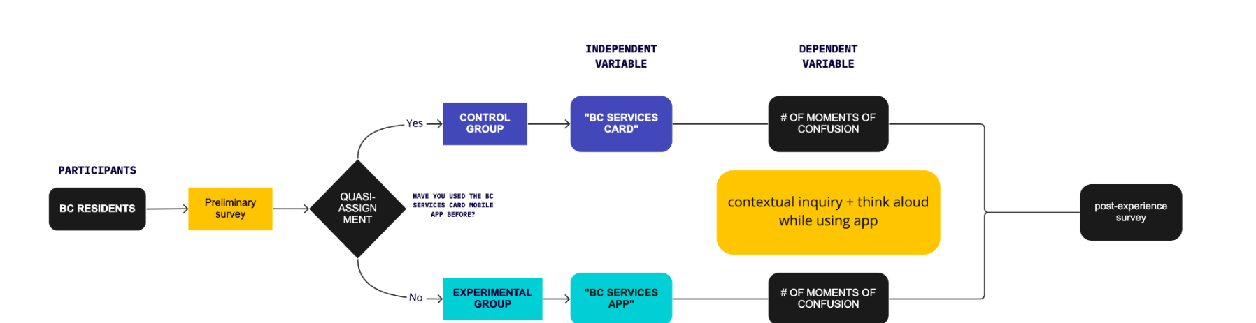
The independent variable was the product name shown to participants — "BC Services Card" (control) versus "BC Services App" (experimental). The dependent variable was the number of moments of confusion. The quasi-assignment between groups depended on previous experience, to account for potential implicit biases that arise from repeated exposure to the app — especially if participants had initially been confused by it before.
The session flow: participant recruitment + demographics & preliminary survey, intro & consent form (5 mins), quasi-assignment, contextual inquiry + think-aloud session (20 mins), and a post-experience survey (5 mins). Consistency between participants' sessions was achieved through standardised researcher protocols.

Methods Rationale
- Recruiting real BC residents strengthened external validity and created public exposure and awareness of the BC Services Card mobile app — an added benefit given the product's audience was the general BC population.
- Preliminary survey assessed each respondent's previous experience with the app to determine quasi-assignment to experimental vs. control group, minimising recall and familiarity bias.
- Demographics survey accounted for cross-cultural differences in interface perception and varying levels of digital and language literacy — grounded in prior cross-cultural eye-tracking research showing behavioural and cognitive differences in how people read interface patterns.
- Contextual inquiry + think-aloud allowed holistic capture of users' exact cognitive experiences in real time, with the option to dig deeper via semi-structured interviews as patterns emerged. Qualitative data from think-aloud sessions was then affinity-mapped and quantified into countable moments of confusion.
- Post-experience survey gave participants time to reflect and add comments at their own pace, eased data analysis, and provided a written channel for participants less confident verbalising their thoughts aloud.
Recruitment & Participants
Target sample: at least 20 BC residents. Participants were recruited through the following initiatives within a $500 funding allocation:
- Location-targeted social media advertisements ($150)
- Posters at BC Services ID-related locations — ICBC, CRA, Health Clinics, etc. ($50)
- Email invites acquired from current app users ($0)
- $300 allocated to three chances to win a $100 e-gift card — compensation for participation
Timeline
- Weeks 1–2 — Participant recruitment (Calendly open until timeslots fill; preliminary survey sent for sign-up) + experiment setup
- Weeks 2–4 — Testing window: 30-minute sessions run until target sample size reached
- Week 5 — Affinity mapping + data analysis: video coding (# of moments of confusion, % per group), sentiment analysis on transcripts, demographics survey analysis
- Week 6 — Report, deliverables, stakeholder presentation + design sprint planning with actionable items addressing research insights
Challenges
- The obvious cause had already been ruled out. Surveys, usability tests, and a full heuristics audit had eliminated interface flaws — so the real cause was something the team's existing methods couldn't see.
- Implicit bias from prior exposure. Participants who had already been confused by the app would carry that bias in — which is exactly why assignment to control vs. experimental was driven by a preliminary survey on previous experience.
- Verbalisation gaps. Some participants are not as confident verbalising their thoughts during think-aloud, risking lost signal.
- External validity. The findings had to hold for real BC residents, not proxy users, across varying levels of digital and language literacy.
Solutions
- Reframed the question as a testable hypothesis. Isolated the product name as the independent variable so confusion could be measured and causally attributed — not just observed.
- Quasi-assignment by prior experience. The preliminary survey sorted participants into control vs. experimental groups to neutralise the implicit bias of repeated exposure.
- Contextual inquiry + think-aloud. Captured users' exact cognitive experiences and obstacles holistically and in the moment, with the option to dig deeper via semi-structured interviews as patterns emerged.
- Post-experience survey. Gave participants time for additional comments, eased data analysis, and provided a written channel for those less confident verbalising thoughts aloud.
- Recruited real BC residents. At least 20 residents — strengthening external validity and raising public awareness of the app — recruited via location-targeted social ads, posters at BC Services ID locations (ICBC, CRA, health clinics), and email invites, with a $500 budget including an e-gift-card incentive draw.
Results + Impact
The synthesis pipeline turned qualitative session footage into decision-ready evidence: video-coding every session for moments of confusion and quantifying the percentage of participants per group experiencing confusion, affinity-mapping the think-aloud transcripts, running sentiment analysis, and cross-referencing with the demographics survey.
Deliverables
- Miro Research Repository — internal team reference including: user profiles, user journeys marked with moments of confusion and specific pain points, and affinity mapping results
- Research Report & Stakeholder Presentation — PDF summary report as a stakeholder hand-out, and a presentation synthesising results and actionable next steps
- Roadmap for Next Steps — action items to iterate based on findings, design sprint planning to address key insights, and rough timeline estimates for task completion across the whole team
Next Steps / Learnings
The expensive mistake in UX is treating every problem as an interface problem, because interfaces are what we know how to fix. Naming and branding sit upstream of the UI — they shape user expectations before a single screen loads.
Isolating the name as a measurable variable is how you stop an organisation from redesigning the same screens forever. The roadmap carried the findings straight into design-sprint planning, with action items and timeline estimates so the whole team could act on the insight — not just acknowledge it.
EquipFlow · 2023 · Generative Research
EquipFlow — Generative Research
Generative research establishing the foundation for a B2B SaaS equipment tracking platform — stakeholder interviews, workflow observation, and competitive analysis.
Overview
Case study in progress — contact Gini directly to discuss this research in detail.
Vancouver Maritime Museum · Experience Design · Children's UX · October–December 2020
Vancouver Maritime Museum Tugboat Simulator
Reimagining a 1990s exhibit as a cooperative, kid-first museum experience.
Overview
The Seaspan Queen wheelhouse had stood in the Vancouver Maritime Museum since the 1990s — a static recreation of a real tugboat that visitors could climb into. As the museum prepared its new Children's Area, the curator wanted a successor: an interactive simulator that taught kids about Vancouver Harbour and modern tugboat operations, supported multiple visitors at once, and stayed engaging in short, drop-in sessions.
Our team had ten weeks to research, prototype, and document a foundation that future CDM cohorts could build on toward a 2022 installation. The work covered everything from cooperative-play theory to Unity buoyancy physics to projected exhibit-space costs.
This case study is told from a dual lens. I held two roles: Co-Project Manager alongside Aashay Mehta, and UX Specialist leading research, user experience, and UI design. The dual hat shaped every decision — every design move had to balance craft against team velocity, and every PM call had to leave room for design quality.
The Brief
"How might we encourage cooperative play that teaches Vancouver Harbour and modern tugboat operations to children, in a quick-pickup, quick-putdown format that works for an unattended children's area in a museum?"
Five hard constraints framed the work:
- The exhibit could not exceed the footprint of the current Seaspan wheelhouse
- It needed to support multiple simultaneous users
- It had to be durable, accessible, and self-contained
- It needed to be engaging across ages — kids, parents, and grandparents — without a docent
- The plan needed to be deliverable enough for CDM to begin Fall 2021 development
A sixth, unstated constraint shaped everything: we were designing in November 2020, mid-pandemic, with a target audience we could not directly access.
How the Project Ran
The team was multidisciplinary by design — two software developers, a 3D artist, a 2D concept artist, and three UX/UI designers — and fully remote, working across time zones. As Co-PM I shared responsibility for setting up the working systems early: a team contract on Google Docs, weekly Scrum on Notion, daily Discord standups, and a Miro board as the shared ideation surface.
A 10-week timeline left no room for organizational drift. We ran tight weekly milestones, each with a named deliverable visible to the client.
Splitting the PM role with Aashay (who served as Scrum Master) gave us a useful division: he led process cadence, I led client-facing communication and the design track. Co-leadership only works if the boundary is explicit, and we revisited that boundary in each retrospective.
Research
Direct user testing with elementary-school children — our primary audience — was effectively off the table. Schools were closed or restricted, parents were cautious about extra-household contact, and the museum itself was operating at reduced capacity. The research strategy had to acknowledge this honestly and find legitimate workarounds rather than pretend it wasn't a constraint.
The approach combined four streams:
- Conversational interviews with parents of elementary-aged children, as a proxy when direct interviews with kids were not possible
- A 100-respondent VMM visitor survey, shared by the client, on visit patterns and demographics
- Secondary research on cooperative play — specifically studies on how shared attention and audio cues drive cooperative behavior in 6–11-year-olds, which directly shaped game mechanics
- Expert interviews with BCIT's head of simulation technology, Gregory Sutton, who advised on what makes a simulator engaging vs. intimidating for non-pilots
What the Research Surfaced
Three findings reshaped the design direction:
- Cooperative play is built on shared attention, not just shared controls. Audio cues — "look here," "help me" — measurably increase cooperative behavior in kids ages 6–11. This pushed audio design from a nice-to-have to a structural element.
- The visitor base is older than expected. Survey data showed adults and seniors as a substantial share of visitors, often accompanying children. The experience needed to entertain caregivers, not just kids.
- Realistic controls would lose the audience fast. Real modern tugboats have two independently rotating propellers (no rudder) and a front keel for pushing — fascinating but punishingly counterintuitive. BCIT's advice was unambiguous: simplify the controls, lock both propellers together, speed up the boat, and treat the simulator as a story delivery vehicle, not a training tool.
Personas & Journey Mapping
Three personas anchored the design, built from interview synthesis and supplemented by secondary research. Each carried a Big Five personality profile, a journey map, and a goals/frustrations breakdown.
The worst-case journey was the most useful research artifact we produced. By walking through a future visitor who arrives overwhelmed, can't find a turn, gets motion sick from the 360° view, and leaves frustrated, we generated specific design constraints — visitor caps per game, time-bounded sessions, clear "ends" between turns, and reserved spots — that the happy-path mapping wouldn't have surfaced.
Concept Development: The Pivot
The earliest concept was a single-pilot tugboat simulator with realistic dual-propeller controls and a complex control panel. It was instantly recognizable as a simulator — and instantly broken as a museum exhibit.
The problem surfaced within the first two weeks: a single-pilot simulator left every other visitor waiting in line with nothing to do. In a children's exhibit, idle visitors are a design failure. The room itself needed something for the waiting group to engage with — ideally something that connected them to the person at the wheel.
This drove the project's central design decision: split the experience into a piloting role and a set of side games that the waiting group could play while the pilot drove. The animal rescue games and landmarks game were born here, not as features for their own sake but as a structural answer to the cooperative-play brief.
Three Games, One Tugboat
The final concept layered three interactions across the exhibit space:
- Import & Export Game — the pilot navigates the tugboat to assist real classes of vessels operating in Vancouver Harbour, while the waiting group taps cargo containers to see what's inside (autos, breakbulk, lumber, coal — drawn from the Port of Vancouver 2019 Financial Report)
- Animal Rescue Game — side-screen scenarios where waiting visitors help an orca affected by noise pollution, or a salmon caught in ocean garbage, learning the real environmental issues facing the harbour
- Landmarks Game — telescope-style identification of Vancouver landmarks visible from the harbour (Canada Place, Lions Gate Bridge, etc.). Prototyped but not fully developed within the timeline.
A consistent design principle was that every game mechanic had to map to a real fact about Vancouver Harbour. The Import/Export game used the actual cargo mix of the Port of Vancouver. The Animal Rescue games used real species native to the harbour and real environmental threats they face.
UI & Visual Design
Wireframes were drafted in Figma and Adobe XD, working through three rounds of internal review and one round of client feedback. The UI system inside the Unity prototype kept the heads-up display intentionally light — a mission board, a current-task callout, an in-game progress indicator, and a small set of contextual prompts. Anything more would have competed with the harbour view that the screens are meant to deliver.
Exhibit Space Concepts
The final deliverable went beyond software. Future CDM teams would need to plan against a real installation budget, so we produced three exhibit-space concepts at staged price points — low, mid, and high. Presenting three options instead of one let the client weigh trade-offs we couldn't make for them.
Outcomes
- Working Unity prototype demonstrating tugboat physics, the harbour environment, the import/export game loop, and the animal rescue game mechanic
- Three exhibit-space concepts at staged budget tiers, each with an installation rationale
- Complete documentation handoff — research, personas, journey maps, user flows, wireframes, style guide, technical specs, source code repository, and continuing contact points (BCIT's Gregory Sutton agreed to continue advising future CDM teams)
- Final client presentation delivered on schedule in week 10, with the work positioned as a foundation for Fall 2021 development and Summer 2022 museum installation
Reflection
Two things stand out looking back at this work.
The first is the research credibility question. Designing for an audience you can't directly access is uncomfortable — it makes every persona feel softer than it should, and it shows up as a real gap in the documentation. The honest answer is that the parent interviews, secondary research, and BCIT consultation gave us a workable foundation, but a future iteration of this project needs direct observation with children to validate game mechanics. We named that gap explicitly in the handoff package rather than hiding it.
The second is the value of designing the failure case. The worst-case user journey map generated more usable design constraints than any other research artifact. It is easy to design for the happy path, especially when the team is excited about the concept; it is much harder, and more useful, to design for the visitor who is overwhelmed, the kid who can't get a turn, the grandparent whose grandchild loses interest after two minutes. Almost every "designed end-state" in the final flow traces back to a problem identified in the worst-case map.
If I had a second pass at this project, the early concept phase would compress by at least two weeks. Most of the meaningful design decisions only became visible after the cooperative-play pivot, and that pivot could have happened in week two instead of week three with sharper framing of the brief up front.
Rember · AI-Native CRM · May 2026 · Web Summit Vancouver
No Data Entry: Designing an AI-Native CRM That Remembers For You
Deep-diving into product-market fit research for Rember — an AI CRM that embeds directly into customer conversations and eliminates manual data entry — representing their booth at Web Summit Vancouver and conducting in-depth interviews with enterprise decision-makers.
Overview
Rember is an AI-native, no data entry CRM that embeds directly into your conversations with customers — automatically building detailed, qualitative memory about each client/customer without anyone needing to type a single note.
Rember has launched with 15 customers across mortgage brokers, design manufacturing agencies, and real estate agents — businesses where relationship quality directly drives sales conversion. I had the opportunity to represent the Rember booth at Web Summit Vancouver (May 2026), conducting live product-market fit research and in-depth interviews with prospective enterprise buyers.
Problems With Current CRMs
Most CRM systems are built around data entry — which means they're only as good as the discipline of the person filling them in. For relationship-driven businesses, that model breaks down fast.
- Manual upkeep required. Qualitative notes about a client's preferences, life events, and history only exist if someone remembered to type them in — which rarely happens after a busy day of calls.
- Siloed conversations. When multiple team members interact with the same client, no one has full context. Customers end up repeating themselves across touchpoints, signalling that the company has forgotten them.
- Dunbar's Number problem. Humans can naturally maintain meaningful relationships with around 150 people. Between personal and professional lives, sales professionals exhaust that capacity quickly — CRMs are supposed to extend it, but manual systems don't.
- Feature bloat vs. adoption. Most CRMs (Salesforce, HubSpot) ship with an overwhelming number of configurations right out of the box. The majority of small-to-mid businesses never use most features — yet are forced to navigate the complexity to access the basics.
How Rember Works
Rember currently operates across two communication channels, with an AI agent at the centre of both.
- Rember Text — SMS-based channel: cc' Rember into any text thread with a client to have it automatically capture and file conversation details
- Rember Chat — Desktop web app with an AI agent interface: talk to it naturally to pull up client summaries, set follow-up reminders, retrieve past interaction history, or ask anything about a client
- Email integration — cc' Rember into email threads to track client communications across your whole team
- Login — Phone number or email with security code (no password friction)
Live demo coming soon — contact Gini to see a walkthrough.
Generative UI — Contacts as Kanban
One of Rember's key design features is a generative UI layer for the contacts database: rather than a static long-scroll vertical list of contacts, the UI dynamically renders the contact list into Kanban-style boards — adapting layout and grouping based on data quantity, relationship complexity, and deal stage context.
For a broker with 30 active leads, it might render as a pipeline Kanban. For an agency with 200 clients at varying stages of engagement, it reorganises by priority tier or last interaction recency. The UI decides — not the user.
Competitive Landscape
- HubSpot — Rember has already migrated 2 clients fully off HubSpot. Core complaint: constant manual upkeep for contact notes, and complex setup for smaller teams who don't need enterprise pipeline tools.
- Salesforce — Enterprise-oriented, high configuration overhead. Rember's current go-to-market is SMB-first (with design partnerships), with enterprise as a longer-term horizon — not a direct competitor yet.
- Airtable — Popular with small teams as a lightweight CRM, but still requires manual row-by-row data entry and has no AI memory layer or conversation context.
Rember's differentiation: zero configuration to get started, zero data entry to maintain, and a conversational AI interface that makes the CRM feel like a smart colleague rather than a database.
Web Summit Vancouver — Field Research
Representing the Rember booth at Web Summit Vancouver (May 2026) gave me direct access to a high-density audience of founders, operators, and enterprise buyers exploring AI tooling. Beyond demoing the product, I ran structured field research to probe product-market fit signals.
The most common FAQs from booth visitors surfaced real user concerns and product clarity gaps:
- "How does it transfer over my existing CRM data from legacy systems?" — migration and data portability was the top anxiety for buyers already entrenched in HubSpot or Salesforce
- "Do I have to cc' Rember every time I start a new email or text thread, or does it monitor my accounts in the background?" — friction of the cc model vs. a passive always-on integration was a recurring point of confusion and hesitation
Product-Market Fit Research Question — Pricing Model
The central research question I investigated at Web Summit and through stakeholder interviews was a pricing model tension with significant business sustainability implications.
Rember currently operates on a flat-fee pricing model of $24.99 USD/month — below competitors, designed to ease go-to-market adoption. But the underlying AI infrastructure is usage-based: the more complex the client's tasks (multi-document retrieval, lengthy summaries, agent-driven follow-up scheduling), the higher the compute cost per user per month.
- The sustainability problem: For power users, the compute cost of running Rember may exceed $24.99/month — making the flat-fee model structurally unprofitable at scale
- The buyer expectation problem: Enterprise and mid-market buyers at the booth strongly preferred flat-fee predictability. Usage-based pricing introduces budget uncertainty that slows procurement approval and renewal
- The decision-maker dynamic: At mid-to-large companies, the person deciding to adopt Rember is rarely the person using it daily. Procurement decisions flow through managers and finance — who prioritise predictable line items over flexible usage costs
Key research question: would target customers accept a usage-based pricing shift, and under what framing?
In-Depth Interview — West Coast Regional Manager, Pacific Controls Ltd.
One of the most valuable conversations from Web Summit was an in-depth session with the West Coast Regional Manager of Pacific Controls Ltd. — an HVAC company with a sales team currently using HubSpot.
The connection came through Rember's existing client network in real estate and mortgage brokerage, pointing toward HVAC as a natural adjacent market — every building has HVAC, and HVAC sales teams manage long-cycle, relationship-intensive client relationships similar to real estate and brokerage.
- Pricing preference: Strong preference for flat-fee over usage-based. His reasoning: internal budget approvals are based on predictable monthly/annual SaaS contracts — usage-based creates uncertainty that makes internal pitching harder and re-approval at renewal more friction-prone
- Internal adoption dynamics: Any new software decision at his level requires review and sign-off from higher-ups — meaning the pitch to switch from HubSpot isn't just product value, it's a change management exercise
- Market opportunity signal: He confirmed that HVAC companies at his scale (regional, relationship-driven, B2B) were underserved by current CRM tooling — complex to configure, but simple enough daily needs that most of HubSpot's features go unused
Key Insights & Implications
- Flat-fee is a go-to-market requirement, not just a preference — usage-based pricing creates procurement friction that disproportionately affects mid-market buyers where the decision-maker and end user are different people
- Migration anxiety is the top adoption barrier — the question isn't whether Rember is better than HubSpot, it's whether the data transition is painless enough to justify the switch cost
- The cc model introduces passive-vs-active confusion — buyers expect AI tools to be ambient; requiring explicit cc'ing per thread feels like work, undermining the "no data entry" promise
- HVAC is a high-signal adjacent vertical — relationship-intensive B2B sales, underserved by current CRM tooling, natural fit for Rember's SMB-first positioning
- Generative UI reduces onboarding friction — presenting contacts as a Kanban (not a spreadsheet) bypasses the configuration overhead that kills CRM adoption in SMB teams
Reflection
Representing a start-up at a major conference is a different kind of design research. You're not behind a one-way mirror — you're in the middle of a crowded hall, running impromptu interviews with buyers who have two minutes and a lot of options.
The real skill is listening past the surface objection to find the underlying system — whether that's procurement dynamics, change management friction, or a pricing model that works for the user but breaks the business. The most important product-market fit questions aren't asked in a lab. They're answered by the person who almost bought it, and didn't.
Ethica Software Systems Inc. · June 2021 – June 2022 · Product Strategy + UX Research
Finding Product-Market Fit: UX Research for a Values-Driven E-Commerce Start-up
Leading end-to-end UX research and design for a browser extension helping ethical consumers make more informed grocery purchasing decisions — from zero to $150K in secured funding.
The Problem
Ethica was building a browser extension to help ethically-conscious consumers make more informed grocery purchasing decisions at the point of sale — surfacing supply chain, environmental, and ethical sourcing information in real time, without disrupting the shopping flow.
The team had a compelling vision but no validated product-market fit. My mandate: find out who actually wanted this, what they needed from it, and whether the current product direction would deliver it.
My Role & Approach
I owned the full UX research and design function within a 5-person start-up — wearing both the researcher and the designer hat throughout the product lifecycle. I built and executed a multi-pronged research programme across the full year of the venture.
- Discovery research: In-depth interviews with 20+ ethically-motivated consumers; field studies observing grocery shopping behaviour online and in-person
- Landscape analysis: Competitive audit of existing ethical consumption tools, browser extensions, and sustainability apps to map the opportunity space
- Survey design & analysis: Quantitative surveys (n=200+) to validate qualitative findings and segment users by motivation and behaviour patterns
- Usability testing: 15+ iterative prototype testing rounds with target users; validated navigation patterns, information hierarchy, and trust signals
- A/B testing: Ran experiments on key interaction patterns (information density, trigger timing, call-to-action language) to optimise conversion and engagement
- Research synthesis & strategy: Translated findings into product vision documents, personas, journey maps, and a prioritised feature roadmap
Key Insights
- Ethical consumers exist on a spectrum — from aspirational (values-aligned but decision-fatigued) to committed (willing to pay more for verified information). The product needed to serve both without alienating either
- Trust was the single biggest barrier: users were deeply sceptical of who defines "ethical" and who funds the ratings — transparency about methodology was non-negotiable
- Friction at the point of purchase was fatal — users would abandon the tool if it slowed their checkout by more than a few seconds
- The most powerful motivator wasn't guilt — it was the feeling of agency: "I can actually make a difference with this purchase"
Design Decisions
- Designed a tiered information architecture: a single-glance "ethical score" at the surface, with a drill-down path for users who wanted sourcing details — serving both user types without compromise
- Built a transparent methodology section into the product — not buried in settings, but surfaced as a trust signal at first use
- Optimised the extension trigger to activate contextually (on cart/checkout pages only) rather than all product pages, dramatically reducing friction without sacrificing reach
- Created an onboarding flow that let users declare their own ethical priorities (environment / labour / local / animal welfare), personalising scores to their values
Outcomes & Impact
- Research directly informed the product pivot that led to $150,000 in secured Mitacs funding and multiple venture internship awards
- Delivered 15 major design iterations validated through structured testing over 12 months
- Developed the full UX research framework — personas, journey maps, testing protocols — adopted by the team as standard operating procedure
- A/B testing results improved key conversion metrics across two critical user flows
Reflection
This project shaped how I think about research in a resource-constrained environment. In a 5-person start-up, you can't do everything — so you have to ruthlessly prioritise the questions that, if answered, would change what you build next.
Learning to run lean research without sacrificing rigour was the most valuable skill I developed here. And learning that your first hypothesis is almost always wrong — and that that's exactly the point — was the most valuable mindset shift.